Dropcaps and Books for Your Looks!
by admin
The DROPCAP is one of the greatest gifts to designers that a typographer can give. With a dropcap, you can add context to the text with image and illustration, style and color, and personality and aesthetics. Dating back to around 400 AD, dropcaps have been used in Illuminated manuscripts all across Europe and the Middle East. These manuscripts were gilded and decorated with small illustration in and around the first letter of the text to help add significance to the text. The majority of illuminated texts that survive from history date from the Middle Ages, the Renaissance, and even a few from Late Antiquity.
In modern texts, dropcaps are often used to embed a sense of nostalgia and preciousness. In classic tales, like Through the Looking Glass, we are able to pay homage to the tradition of illuminated drop caps while using modern typesetting aesthetics and grids.
Take a look at the following examples of exceptional dropcap designs and designers.
__
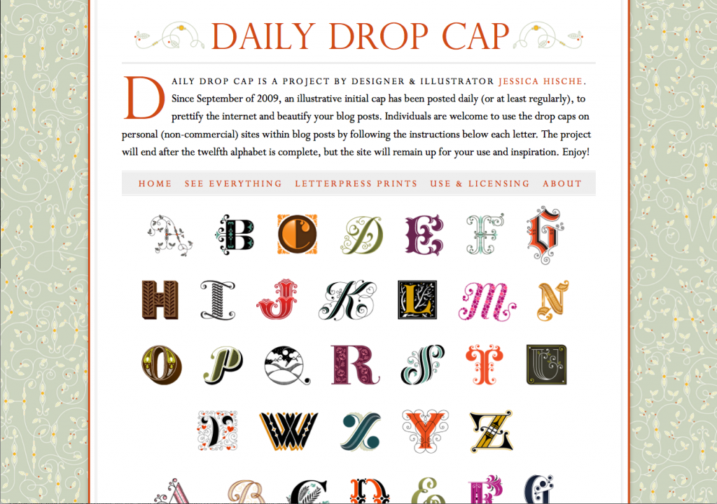
Jessica Hische is freaking amazing! She is the queen of all lettering gods and goddesses. Check her out. Here is a couple of her awesome projects that are relevant to ours.
and
__
And then there is this, TYPE FIGHT! TYPEFIGHT is an arena for alphabetic altercations, calligraphic contests, consonant combat, figural fisticuffs, semiotic showdowns, and 210 pt. tussles. Two men letter, one man leave.
Harry Potter never looked so cool!
This is a project by Hungarian design student Kinsco Nagy and is pretty awesome.
Read more about this project Here.


